
Estimated reading time : 2 min · Published October 1, 2026
Prepare characters actually used
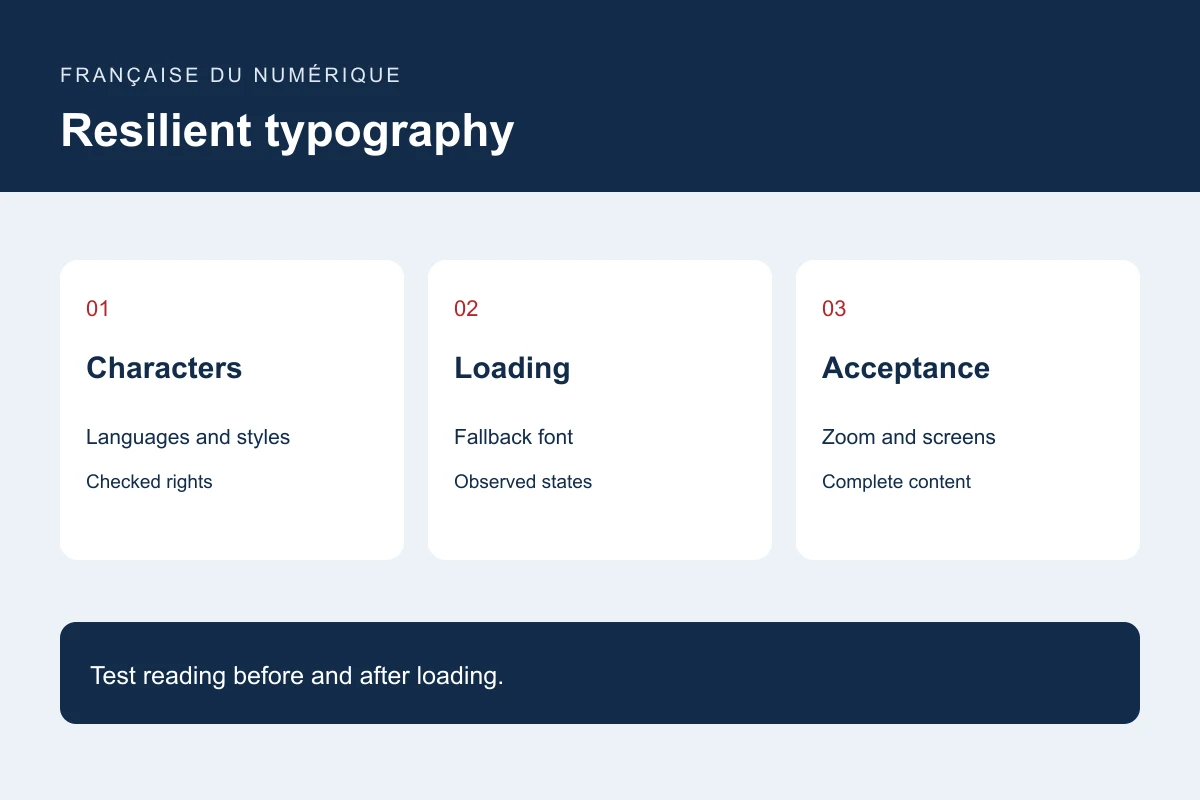
Collect samples in every language with accents, numbers, punctuation and long words. Include forms and errors rather than only a short heading. Check writing direction and language-specific characters within the site’s scope.
Choose necessary weights and styles before multiplying files. Reduce variants according to content and hierarchy rather than removing useful distinctions. Check licence conditions and permitted hosting with the selected source.
Choose a loading strategy
font-display governs how a font is displayed according to its availability. MDN describes block, swap, fallback and optional. Choose according to reading needs and context, then observe actual browser behaviour.
Define a fallback suitable for the intended reading experience. Test without the custom font. A preload helps only when the file is necessary and matches the requested resource; excessive preloading may compete with essential content.
Test layout, zoom and states
Check a dense page, navigation, table and form with final and fallback fonts. Test narrow screens and zoom. Buttons, prices, names and errors should remain available when text takes more space.
Compare states before and after loading, including line breaks, height and primary-button movement. Capture specified conditions rather than judging an already-loaded desktop screen. Repeat languages that differ most from the initial design.
Maintain the typography decision
Keep origin, checked rights, files, tested languages and loading rules in the project documentation. Repeat representative examples before a brand or font change affects every screen.
Remove unused variants only after checking content and documents that may still request them. Deliver readable typography with tested fallbacks, suitable character coverage and a limited list of justified resources.
Primary documentation : MDN — font-display.